
Website critique for Software company Leave Wizard planner
Many businesses work so hard on there software and producing a product to be useful, efficient and easy to use. Then when it goes to market they produce a website to help potential users find it. How sad it is when the website doesn’t serve its purpose. When it doesn’t find useful visitors from the search engines.
A website needs to attract people that are ready to commit. It also needs to communicate what its products do in the quickest way possible. Its focus should be obvious and clear to any new visitor. Today’s website is a fine example of a software company that has followed some basic principles and got the above right in most areas. Once again the challenge will be to find areas where it could still improve. Welcome to today’s website critique audit.
If you want to be considered for my free website review then make sure you fill out the form and I will gladly consider making you the next one in my series.
Website Critique For Software Company review #5
Bournemouth based company called Leave Wizard at leavewizard.com get scrutinised today. So take a look at how I got on with their Website Critique For Software Company Leave Wizard below.
Timestamp for the Leave Wizard website audit
- 0:50 Introduction
- 1:44 Initial look at the Leave Wizard website
- 2:00 Website overview on layout and design
- 3:02 Design overview and home page clarity
- 4:20 Tip 1 – GTMetrix shows improvements for loading time
- 5:00 Icon in footer could be resized
- 6:20 its mobile friendly
- 6:40 Tip 2 – SEO improvements by writing more articles on traffic keywords
- 8:10 Registry area issue on footer menu
- 8:40 Domain issue
- 9:25 Logo to home page for usability benefits
- 10:10 Double title and duplicate descriptions on Home page and features page
- 11:10 SEO requires unique page descriptions
- 11:50 Tip 3 – The blog needs more consistency
- 12:40 Obvious inconsistencies on blog
- 13:30 Google Search SERPS impressive
- 13:50 Tip 4 – You need a Google My Business listing – branding opportunity
- 14:00 How Google My Business Should look
- 15:10 Tip 5 – Use Snippets to dominate search results eg People Also Ask
- 16:30 Definitely can use featured snippets
- 17:00 Use Yoast for WordPress to add FAQ snippets
- 17:50 Full summary and run down of the areas that need attention
Website Review Positives For Leave Wizard

Amongst the obvious strengths from a visit to their website includes:
- Colour scheme works well with good contrasts on important buttons
- Great introductory video for users wanting to understand what you do
- Social shares are incredibly good on this website
- Back links are extremely good
- Throughout the site their are easy ways to sign up and use or trial the product
- Good use of blog posts and constant updates
- Looks like you have a reasonable amount of qualified traffic coming in
- Has a good clear call to action above the fold on both mobile and desktop visits.
Website Review : 5 Required Improvements
Lets now take the real challenge. Can I find 5 areas the site needs to improve on.
1. Serve scaled images
In the example video above GTMetrix revealed several areas effecting loading times.
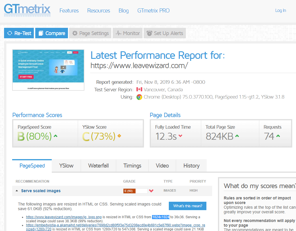
The warning from #pagespeed was to serve scales images. So what’s this mean?
If images are resized in HTML or CSS then you are downloading data that isn’t needed. If it isn’t needed it slows down loading times for no justifiable reason. The report shows that serving scaled images could save them a 92% reduction.
2. SEO / Usability improvements
The website performs well overall in the search engine results. This is due to its very high Social shares. Back links are also incredibly good on this website, so these are big factors as to why it has a strong authority in the search engines.
Taking the keyword “leave wizard” You are #1 on the Search Engine Results Page (SERP) brings in an average 880 visitors a month in UK – so that’s good and you can’t improve that as such though we will look at some important tricks your missing out on which will dilute your number 1 status.
Yet their are areas where there are lots of small niggles that I’ve discovered. Although few are of high importance, discovering them and batching them together under the heading of SEO and Usability Improvements or Search Engine Optimisation makes sense. All these small things compound into a way of effecting the sites greater potential. So I’ve put some comments together in this section:
SEO improvement – keyword domination
Taking the keyword “leave planner” You are 7th on the Search Engine Results Page (SERP) brings in an average 140 visitors a month in USA
Taking the keyword “leave planner” You are 4th on the Search Engine Results Page (SERP) brings in an average 3600 visitors a month in UK
FYI – Leave Planner – Is this a competitor? They are receiving over 1100 from that keyword each month world wide.
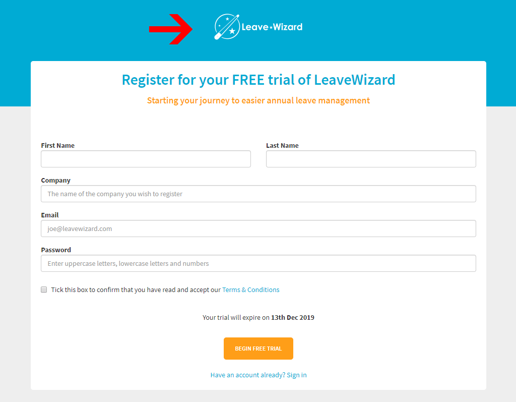
Usability improvement – Logo on App Registration
The logo at top of your registration page would really be usable if there was a link back to the home page, So i would recommend a link back to the main site – see red arrow
SEO / Usability improvements Domain missing on server status
From the left footer menu on the API section of the site , it says leavewizardstatus.com. This domain registration expired on 10/14/2019.
#1 leave wizard 880 UK
Home and Features page same title and description – not good for search engines
On the main home page and Features page they both have the same Title and Duplicate meta descriptions. Is this being picky or important?
As with all SEO questions you have to ask in this order:
- 1st does this benefit the visitor?
- 2nd does this benefit the search engine spider?
It important to avoid duplicate meta descriptions and titles.
1st Question – For visitors – Where is the value when you are accessing duplicate descriptions, if the information is different then the meta tags need to be different.
2nd Question – For search engines – finding duplicate meta descriptions can make the ranking process more difficult as engine crawlers will have a hard time figuring out the differences between pages and what should rank and what shouldn’t.
3. Blog integration – not seamless
The blog appears a bit disjointed, it feels bolted on. Webflow and WordPress by the looks of it. I think this is due to using a different CMS. Does it have to be outside of the main website? Could the blog be fully integrated?
4. Leave Wizard – Where is your Google my business?
I see you have a yell.com listing. But the most important listing in 2020 is Google my business. I’ve written a really useful article that will help you get it up and running on Google my business tips and tricks.

5. Start using “People also ask”
You are missing out on extra traffic exposure. Try submitting featured snippets and then getting extra traffic from the section “People also ask”. If I search “online employee annual leave planner” you are right up there in the results, but nothing is shown in the “People also ask”. Try using featured snippets and Google may well add your FAQs into that section.

If you’re losing traffic over time, its due to the fact that studies show you are probably getting 31% less traffic by NOT owning the Featured Snippet position. Its really important to realise that even if you rank #1 you are haemorrhaging traffic to these new Google features. Ready to increase traffic by 31+%? Then you need this Yoast tool ….
Special Top Tip Using Yoast
From what i can make out your blog is using WordPress. If you install the awesome Yoast plugin you can then add Data Blocks which include the correct markup schema for FAQs. After you’ve added the FAQ block, you can start to add questions and answers to it. These are where Google will get the fodder for “People also ask”.
Of course criticising websites is not what I do best. I would much rather improve websites A fresh new redesigned mobile friendly website is always a joy to deliver for a new client. Take a look at my successes at my web design portfolio or apply for a free consultation.