
How Do You Test A Mobile Website With A Chrome Extension?
First you should check how your website looks on all other devices, not just mobiles. This includes various operating systems and browsers. It’s always good when you can check how your website looks on variable browsers, mobiles and Operating systems.
Most web sites these days have code settings to render according to the user agent received. A user agent is a line of code identifying the browser and operating system to the web server.
So for your website to render correctly, it needs to know if the visitor is using a mobile device or some other device. e.g. are you visiting on an iPad or smartwatch? Also what operating system is it using? As you can imagine the challenge of checking all these variations can be an ordeal.
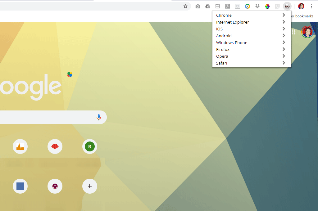
Google chrome user-agent switcher : The best website test
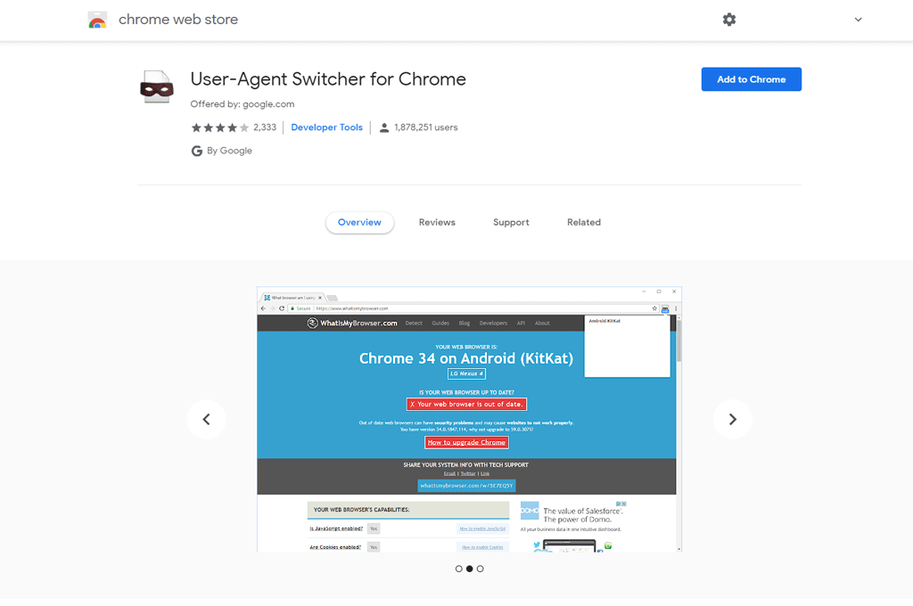
So this little Chrome Extension will prove handy if you want to check your web site. You can download it here .

Get Testing
That’s it. Now you can check test your mobile website and see how it looks on a using Android Kit Kat or if it looks great on Internet Explorer. If you need help making your website mobile friendly then make sure you take advantage of our special mobile design offer.
In conclusion, if you want to test your website loading speed on desktops and Mobiles then I use pagespeed insights from Google.