
How do I know if My website’s mobile friendly?
Everyone knows the importance of having a website that works on mobiles. But is there a way of knowing if a website is truly “Mobile Friendly” Today we take a look at 2 correct ways to test if you are mobile friendly and one common incorrect way.
First of all let’s address a common misconception. Mobile friendly does not mean “I can see my website on my mobile, so it must be mobile friendly!” It’s worth noting that most websites are viewable on a mobile browser, but seeing a website is not the same as reading or using a website. Don’t be fooled, Google is able to know if the text is readable or if the loading times are ridiculous, so it will penalise your search engine results page if this isn’t addressed
So how can you check its mobile friendly?
Google is so determined to reward mobile friendly websites they provide some really useful tools for website owners. Here are our 2 favorites…
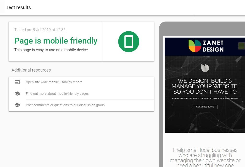
Tool 1. Use The Mobile Friendly Test
The easiest tool to use is Google’s Mobile Friendly Test Tool. This tool is our first recommendation because it is so simple.
Step 1) Enter your website address and Google will go and check it for you.
Step 2) Review the results and fix anything that causes a fail..
Tool 2. Use The Google Search Console
Google provides this really useful check, but it does require a little bit of setup and registration time. It’s well worth it, as you get more detail and analytical value from the results.
Step 1) Setup a Google Search Console account
Step 2) Go to the Enhancements area on the left hand menu
Step 3) Then select Mobile Usability options. Here you can ask it to crawl your site and come back with its recommendations.
Step 4) Review the scan results. Once you are aware of the issues, follow the links and put right any recommendations.
Step 5) You can then request the spider to revisit and review your adjustments. A few days later it will give you the thumbs up if you have resolved the problem. Just work through each recommendation and you should soon have a fully-fledged mobile friendly web site indexed nicely with Google.

You get a mobile friendly error – now what?
Google has equipped and empowered you so you or your webmaster can work together.
So remember you and Google are actually trying to achieve the same thing, but for a different reason.
I’m Mobile Friendly! So Whats In It For You And Google
You want your website readable and usable on mobiles and other devices : so visitors can contact you and become potential clients.
Google want your website readable and usable on mobiles and other devices : so visitors can get relevant results and this will keep Google as the best search engine on the open market, meaning business will continue to pay for top advertising through Google Ads
A different motivation but notice the same starting point.
So what types of things will it find as issues for mobile visitors. The clear guidance of what to do normal comes from a small statement with a link. If your familiar with HTML and CSS then it’s a straight forward process for resolving the most common issues.
If your web site has been built correctly and in the last few years it will probably fly through with few if any problems. Most designs since 2016 should be responsive in effect they fit to whatever the device is whether its mobile tablets , large screens or a small mobile phone. The way the content flows is to fill the areas in a way that keeps it functional, graceful and readable.

Other considerations
Get a responsive website template built.
Avoid intrusive pop ups or forms that make it hard to navigate.
Makes sure the menu works using a finger not a mouse, this normally requires a completely different menu for below around 800 pixel width
So many amateur web designers don’t understand the importance of optimisation. It improves usability on mobile devices and the quality of an image visually is hardly noticeable. Your goal is to make your website load as quickly as possible. I use Photoshop to optimise my own images, but you may find WP Smush a great plugin if you aren’t familiar with optimisation in WordPress.
Make sure your website is loading fast by optimising images and only loading the essential areas to the site for mobiles. If you can compress and minify HTML and CSS files it will help speed up the load times and avoid a high bounce rate. You could also try removing unwanted plugins and themes if you have a WordPress website.
You can make use of plugins like WP Super Minify or Fast Velocity Minify to seamlessly achieve this task. And for more information, you can refer to this guide on How to Minify CSS, HTML & JavaScript files in WordPress by WPBeginner.
When you are truly mobile friendly, you will then want to consider our recent article that helps you add your site to Google Discover. A process to help add news snippets to googles app.
Zanet Design are based in Bournemouth, Dorset and are experts in solving mobile friendly issues. With 20 years experience of working with small business, you know your in safe hands. So feel free to contact us if we can be of any help.