
Branding in 2021 should be great fun if you are a web designer.
There are two things really driving the web design trends for this coming year.
A) Freedom with asymmetrical designs and mini animations.
B) Even more mobile-friendly branding and thumb usability.
These factors alone are in the driving seat to have a great impact on the websites your competitors are having designed while we speak. Web design cannot help but be affected by trends. 2021 web design is no exception for one massive reason….smartphones or mobiles. Your branding in 2021, your designs, your layouts are all having a large impact because of the overwhelming traffic coming from mobiles.
What is branding?
Before we start looking at some examples of the top 7 design trends, let’s be clear about what branding is. Often there is some confusion over what it covers. It’s more than the logo, website, colour scheme and style guide. Actually, that’s your brand identity. Branding also includes the tone and how you are perceived by your audience. Amazon’s CEO says, “Your brand is what people say about you when you’re not in the room”.

So the impact of branding in 2020 will require a slightly different approach from previous years. It’s less about the design and more about the experience. Going mobile-friendly, offering quick answers using chatbots, offering a fast loading beautiful interface to your visitors on all devices and mediums is very much part of your branding too.
Branding in 2021 Video
Timestamp to help you navigate to the right part
- 1:10 introduction – branding questions
- 1:51 understanding branding
- 3:48 Tip 1. Branding with color
- 6:10 Tip 2. Asymmetrical designs
- 7:47 Tip 3. Greater use of video
- 10:07 Tip 4. Thumb friendly navigation
- 12:10 Tip 5. Simple fast loading website
- 15:05 Tip 6. Combining images with fonts
- 17:15 Tip 7. Nostalgic design and branding
- 20:20 Concluding comments
#1 Branding with muted colors
The trend of bright colours in previous years is making room for a more meaningful colour palette. As you may have seen in the excellent article called The Meaning of Colors, there it discusses how colours evoke reactions from your visitors. In 2020 you need to uncover the meaning of colours for your branding as it needs to reflect the mood of your business. Colours communicate. If you use Grayscale you are playing it very safe.
What is the right colour for your business? What colour mood do you want to present? One of the new trends is to neutralise branding with grey or one-colour designs
Using black white and grey gives you a way of then punching with power when you do use colour. It provides a background for the right focal area and an amount of contrast when colour is used. They often say that the call to action button should be a different colour button to the rest of the website branding. In this case, it really will stand out. Yellows, oranges, reds and greens are by far the best colours to use if you want to reach the human eye.
Unsaturated and muted colours are a great vehicle for then enabling one colour to stand out. This is a really nice trending in 2020 as the ultimate way to make a point or emphasis an important focal message.
For more on the latest meanings of color and branding for 2020:
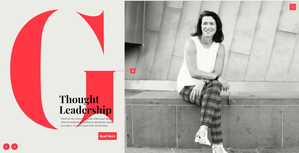
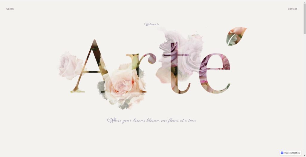
#2 Branding in 2021 with asymmetrical layouts
So let’s just be clear about what an asymmetrical layout is. Unlike most websites that have a balance from left to right. We are talking of web layouts that are not balanced whatsoever. Having said that, the art of asymmetrical branding and design is it looks very good. Not easy to do, which means it will push some designers in 2021 to do some thought-provoking things.
So we predict designers are going to challenge standard layouts. As we know, in design terms though, less is often more and asymmetry can be powerful and eye-catching.
Take a look at an example of the website that has absolutely got this right.
This is precisely why minimalism along with asymmetrical layouts are among the most difficult design styles to execute.
This approach stands out because it is literally outside the box. As the researchers put it, “The power of open composition is its ability to tap into the audience’s imagination and spark curiosity.” I’m excited to see how far the designs can change, but it’s a certainty it is changing.
#3 Video for 2021 – Widespread use
Have you ever heard the saying “Customers relate to people, not products” Well that is the case? Personalization, if done right, can be a huge brand asset. In 2021 it will be even more popular. With video, you can start talking to your audience on topics they want to relate to. 94% of PR managers said that video helps users to understand the idea of a project. As an expert, your list of followers will grow and help establish authenticity and trust. All through the use of embedded video. If you need to know how to embed a Youtube video don’t miss this exclusive tutorial.

Trust is one reason why video is going to grow. The other reason is that the amount of time spent on a page is a metric measured by search engines You have heard that retention is an important search engine metric. Right? It’s sometimes known as dwell time.
With Google using over 200 ranking factors and dwell time bounce rate and time on page are all worthy of consideration. One way to keep a visitor engaged on the page is to offer them the chance to see the content of what they are reading in a video format. For example, if you haven’t already done so, look at the video at the beginning of this article. You will then see why the iPhone 11 pro picture is shown above. Without video, not everything in the article would make sense. Or of course, you can visit it on youtube here
Video has been around for some time. Google is the first search engine people turn to. Do you know which search engine is number 2 in 2021? YouTube. Yes, I know it isn’t considered a search engine. But realistically it is the 2nd most visited place visitors go to search for something. Oh yes, and who owns YouTube? Google!. Combine the two and you have a powerful web page and branding. Most visitors are willing to spend 5 or more minutes viewing a relevant video. That is a lot of time on a web page.
#4. Branding in 2021 with thumb friendly navigation
Responsive design became big from around 2014 onwards. The purpose then was to make websites even more mobile-friendly. In 2020, web design will be focused on creating sites that are thumb-friendly. 2021 design is driven by the demand for visiting every website on a mobile.
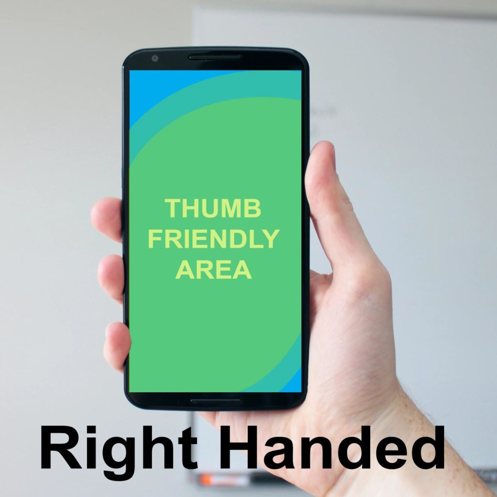
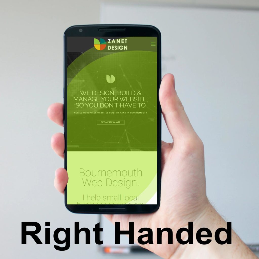
As most people use their mobile devices with one hand, you can see why this is going to be so important. One finger is used to log on to the device. However, your thumb is used to navigate menus. This has been coined with the phrase being “thumb-friendly. Branding apps and creating websites that are thumb-friendly will become huge in 2021.
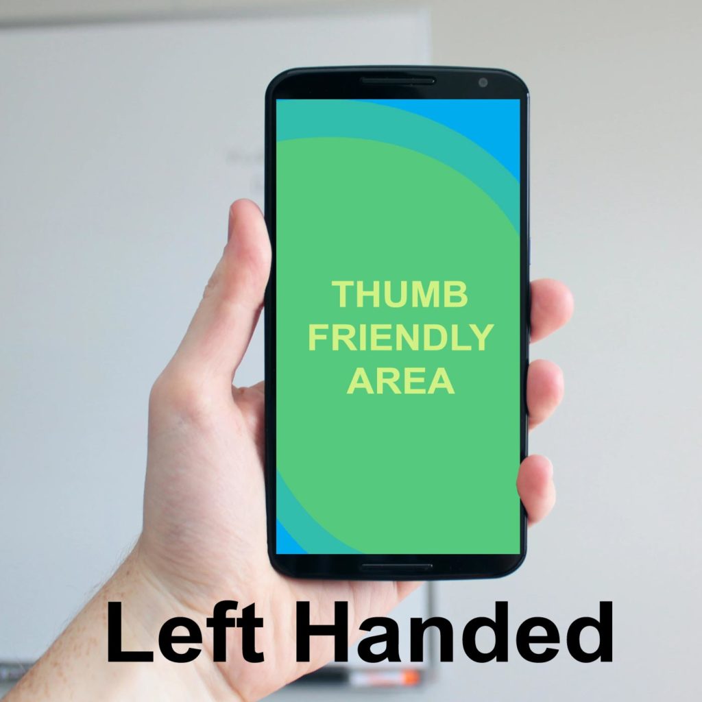
I took a look to see how my website looked (zanet.co.uk) when it’s on my thumb-friendly cutout. My main navigation works fine for right-handed people, but left-handed thumbs have no chance. On the plus side, my main button is reachable and central for both left and right-handed thumbs.
Google knows this so if your website isn’t designed and branded to work on a mobile, Google is gradually dropping your ranking. If your web design is slow, hard to use, difficult to read, or slow to render on first paint. You will unavoidably suffer. 2020 design is driven by Mobile demand.
Don’t underestimate the importance of a mobile-friendly, thumb-friendly website for the coming year. Mobile visitors account for over half of web traffic worldwide. In the second quarter of 2019, mobile devices (excluding tablets) generated 48.91 per cent of global website traffic, consistently hovering around the 50 per cent mark since the beginning of 2017.
#5 Simple fast loading websites
So if your website isn’t loading almost immediately, visitors are now switching off. The trend of making a simple mobile-friendly version of a website will continue. Even with more momentum in 2021 because Google now penalises you if you are too slow. A simple check on Google page speed insights (https://developers.google.com/speed/pagespeed/insights/) will confirm this.
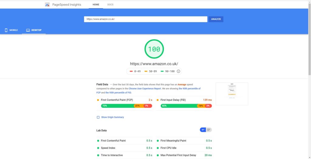
Fast loading pages mean more visitors from the search engines in 2021. 50% of visitors to a website on a mobile expect a site to load in two seconds or less when they click on a site. So simplified versions of websites are now becoming the trend. This is affecting the web design and layout as well as the content.
What is served on the mobile version will be a lot less than the full desktop version. Understandably this will help keep loading times down. Additionally, the large graphics and optimised background images we saw in previous years will have less importance in 2020 for the favour of speed on mobile. Google certainly supports the idea that less is more if you are branding and designing for 2020.
#6. Branding with typography
One way this will take off in 2021 is combining images into font design
Huge typography makes a big statement, but it can also fill the screen with too much of a single colour. Filling gigantic letters with an image has been done before, but with asymmetrical layouts, it’s a breath of fresh air. This type of font design breaks up the monotony and ties lettering to other design visuals.
The other way is for branding to use really strong typography
With typography leading the design, you then have a high level of freedom, expression and experimentation This is branding with typography taking its rightful place. Designers that are big on typography, will provide some amazing, attention-grabbing designs next year.
#7 Nostalgic designs inspired by the past
Using just a few fonts and some cutout pictures combined will look stunning. Faded colours too will help make the nostalgic look a bit more faded and dated looking.
Less is more
Zanet Fact for Branding 2020
The days of cluttered web pages have now gone. The branding where there are too many fonts will be left behind. Clutter drives away customers, while clean pages pull them in.
Conclusion
Branding in 2021 will be a very radical change. As I have shown these changes are due to the need for improved loading speed. Are you branding with this in mind? What about the increased number of mobiles accessing the web. It’s not just about being mobile-ready but also thumb-friendly navigation. If users aren’t driving these 7 changes above, then the search engines are. The way SEO works tend to dictate how web designers build. There is no doubt, in 2022, the big search engines are rewarding those designers that follow the basics. A fast loading, mobile-friendly, usable website, that looks stunning.